
Background and Concept
Over the last decade Favro developer Hansoft has grown to become a global leader in the agile software space, with companies around the world using Hansofts tools to manage their projects as they transition to agile enterprises.
In 2014 Hansoft approached us with their idea of the next generation of collaboration apps for teams. We started out by developing a 20-page pitch for the project and were quickly invited to co-design the app, brand, website, and online marketing over an 18 month period.

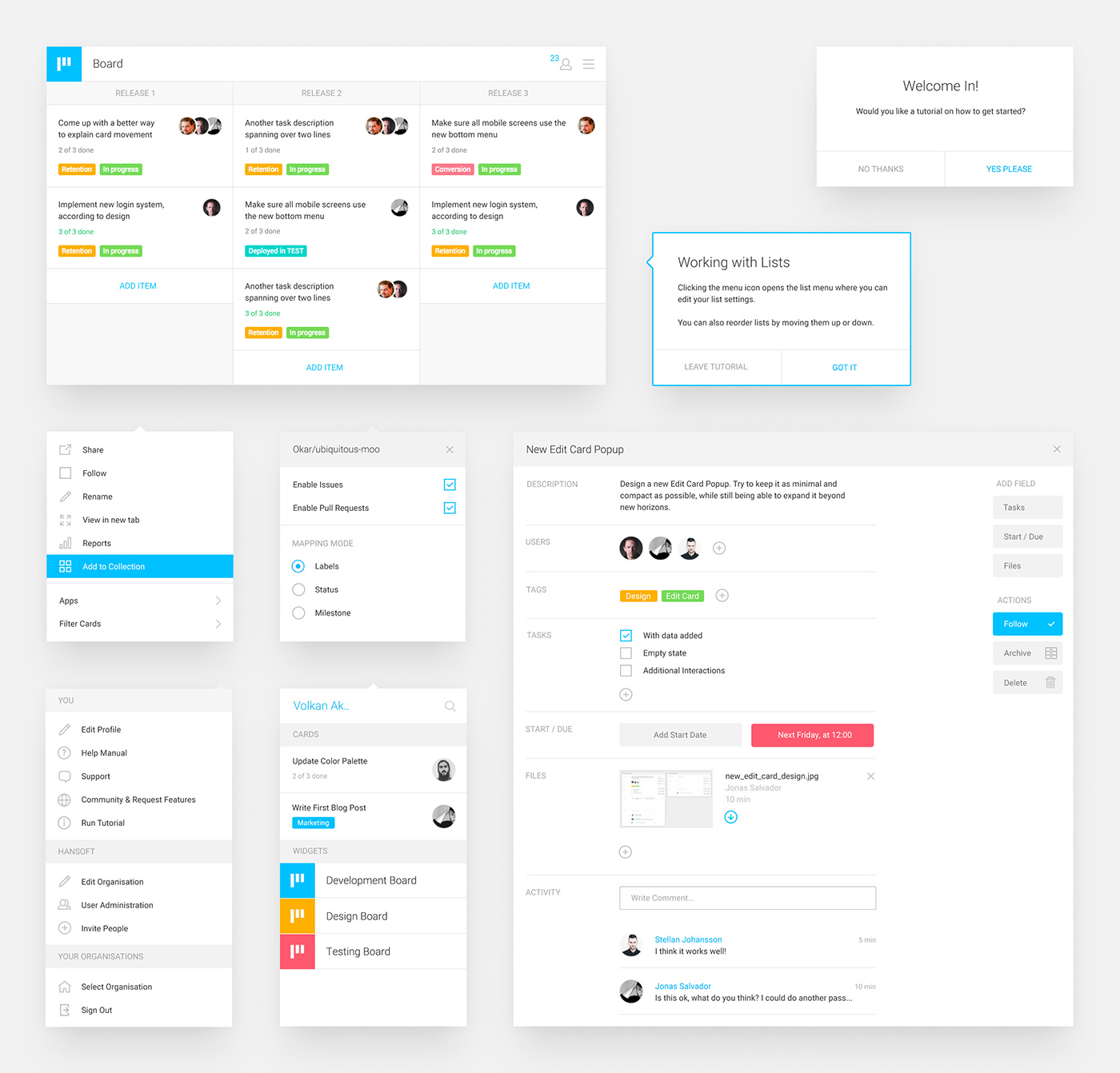
Desktop UX
After the initial design pitch was accepted a long process of sketching the UX foundation for the desktop application was started. The process was done in close collaboration with Hansoft, and literally hundreds of screens, menus and popups were tested and iterated upon.
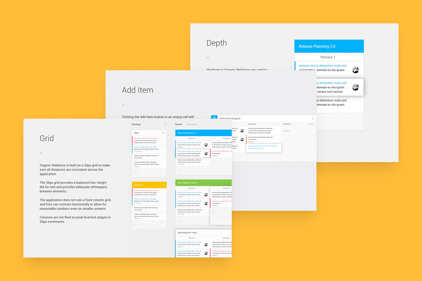
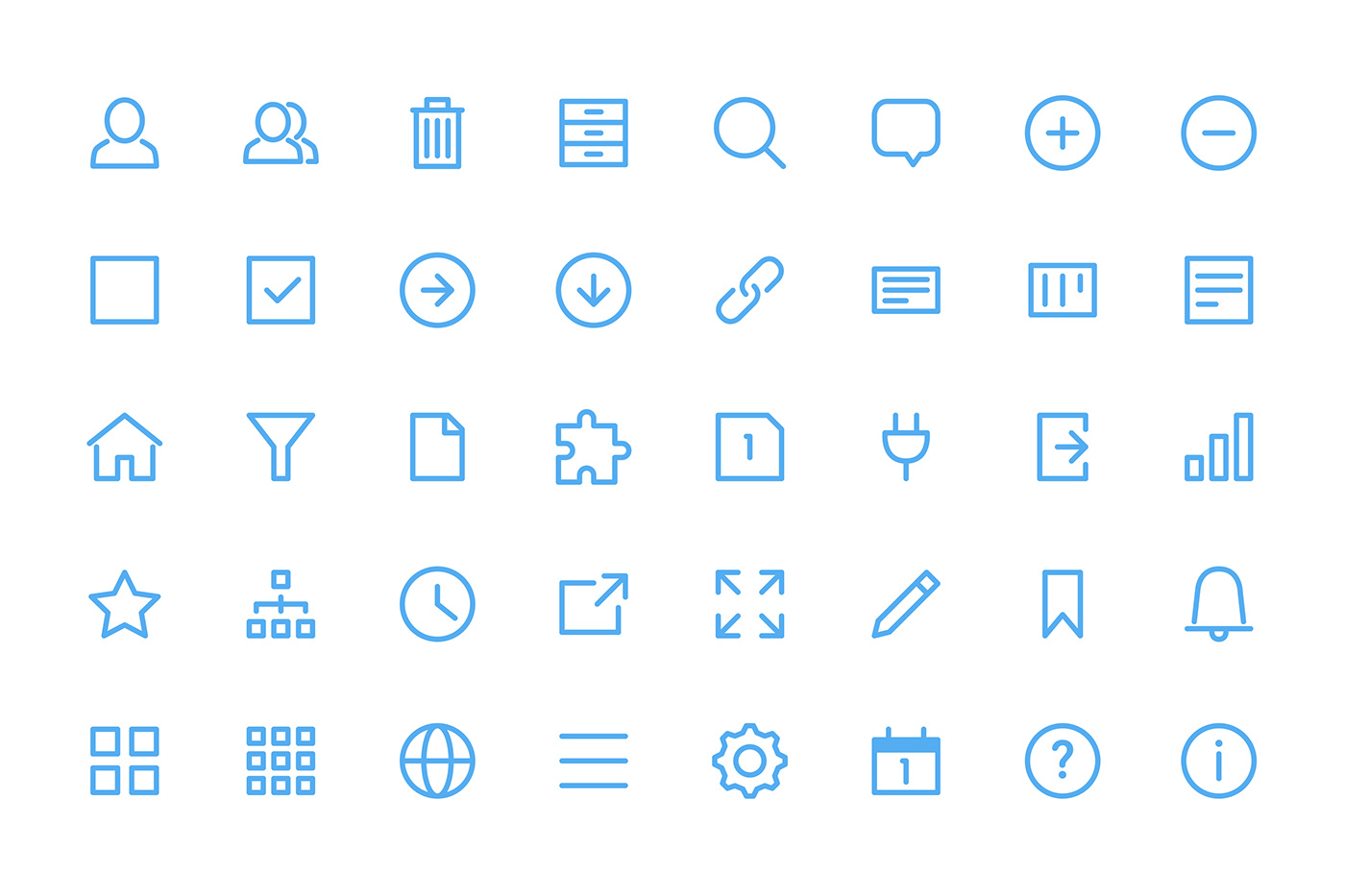
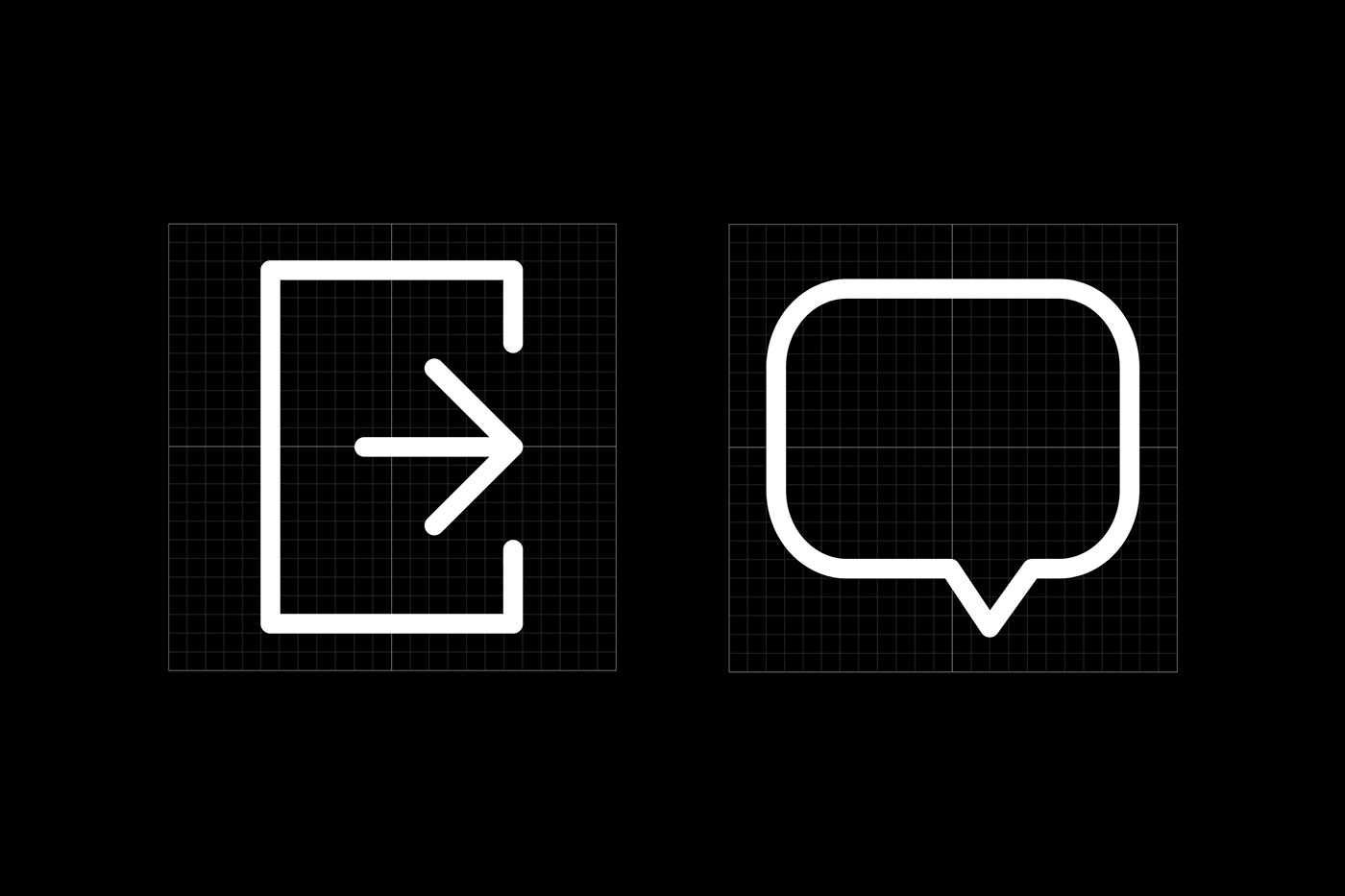
Icon Library
During this process we also started building an icon library, which gradually grew as the application expanded. A set of rules and a grid on which the icons were constructed ensured that the library could keep growing without loosing it’s consistent look.

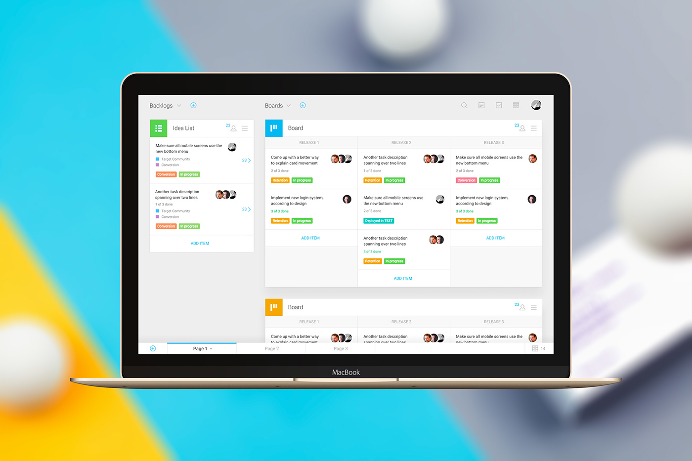
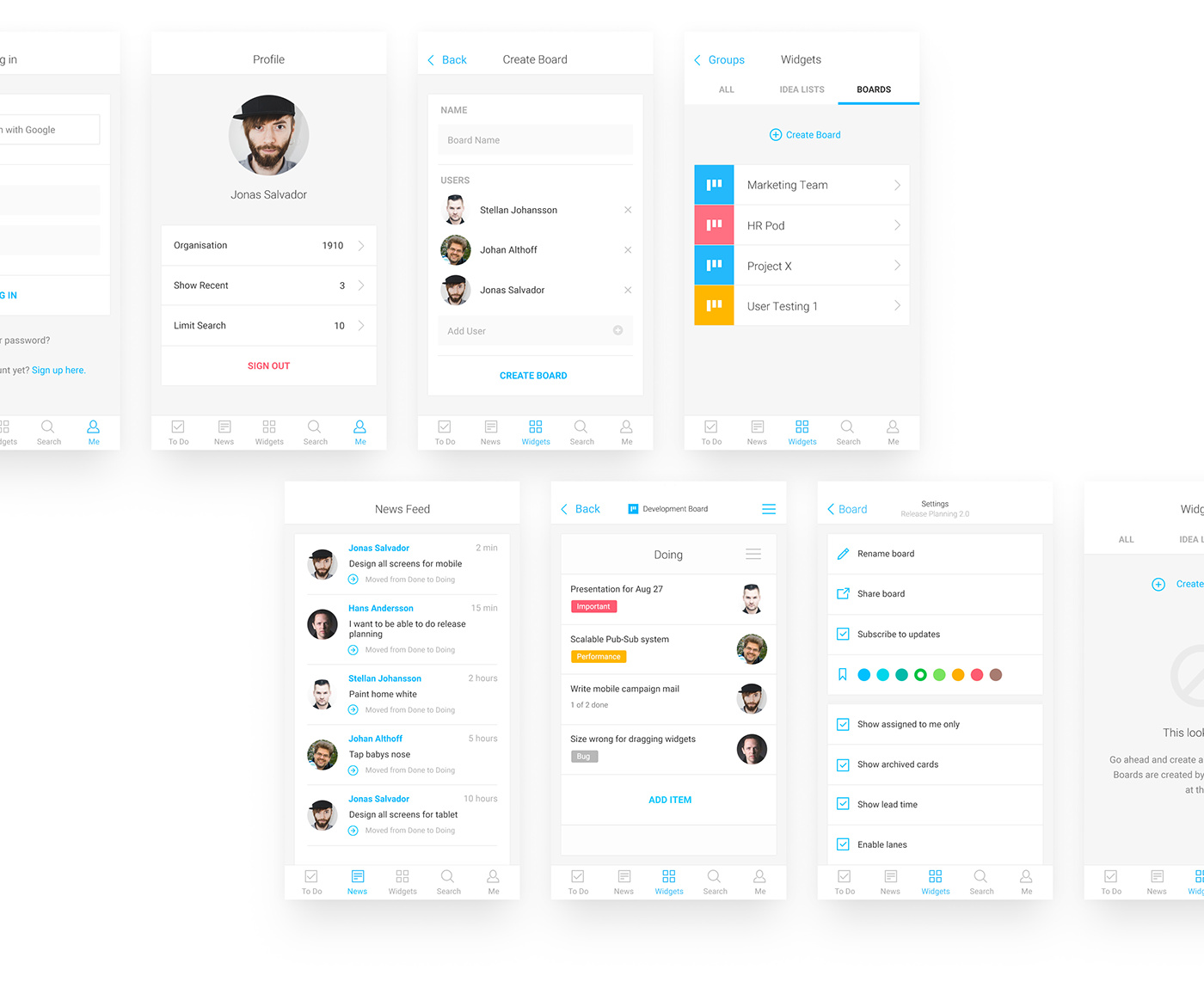
Mobile UX
After the foundation of the desktop application was laid out, we started planning the mobile counterpart. Hansoft wanted to make sure that the mobile app was as fully featured as the desktop version, and not just a simple viewer without the control needed for advanced users.
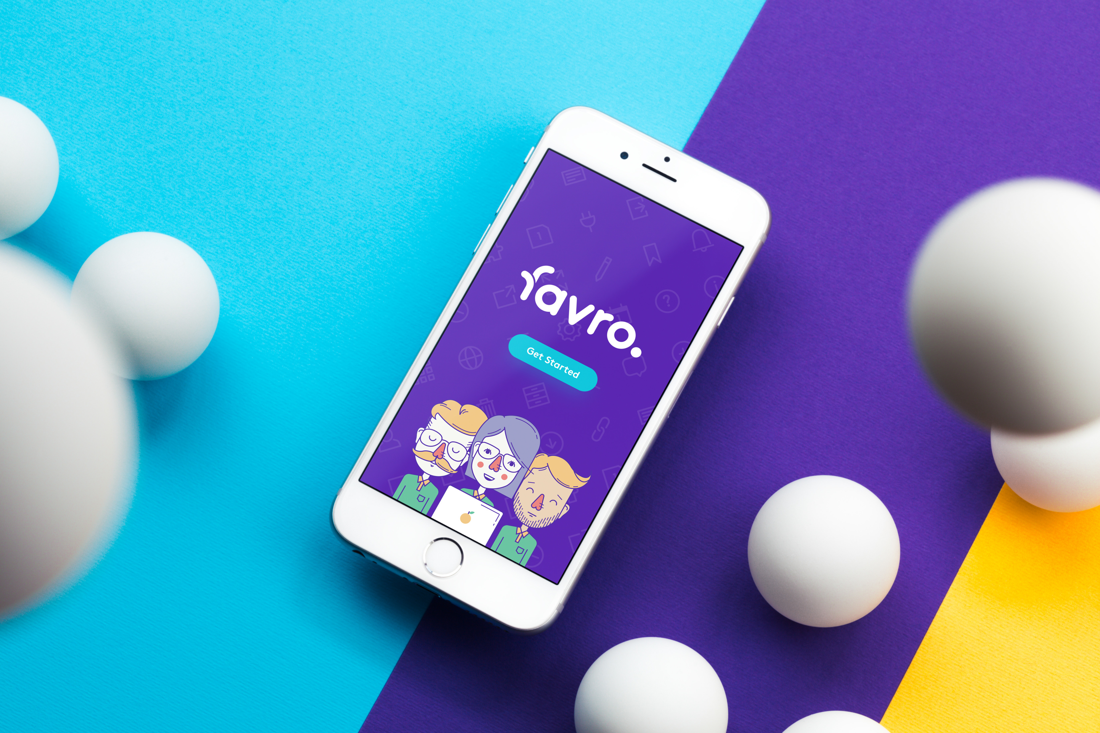
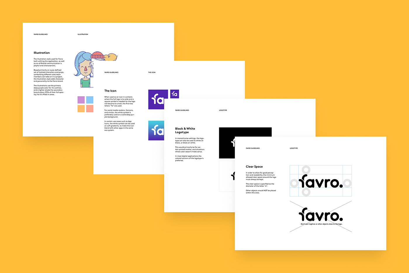
The Logotype and Icon
After around a year of designing and testing the UX for the apps, we were once again invited to work on the logotype and brand. Hansoft had now decided on the name Favro, and a number of different directions for the brand was developed and iterated upon, before reaching a final consensus.

“The Favro brand is meant to look accessible and trustworthy. Cute but competent. We tried many different styles before reaching a solution that ticked the boxes on all of our goals.”
Jonas Salvador, Art Director & Partner at 1910
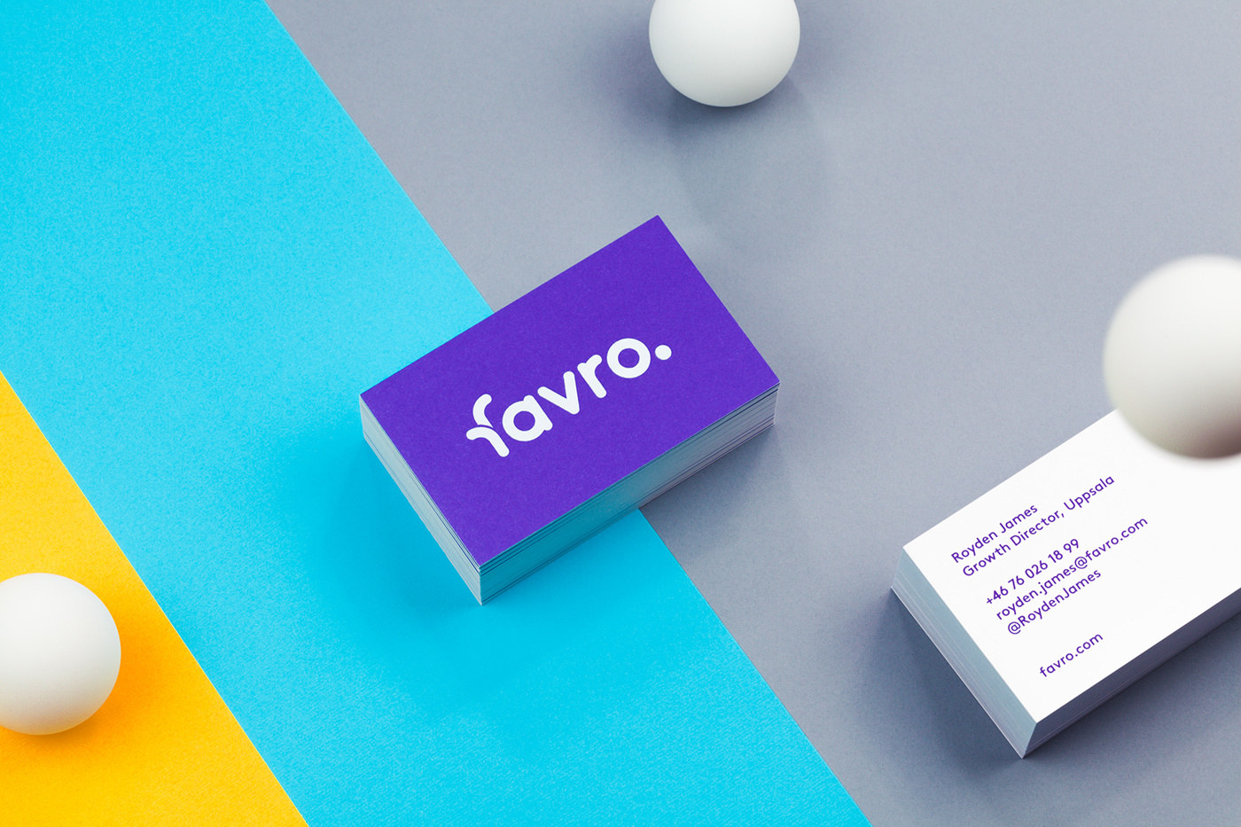
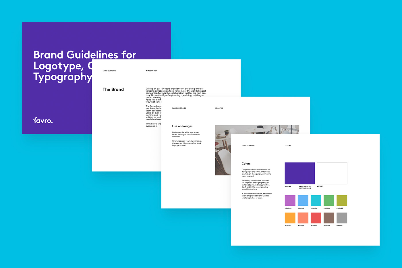
The Brand
Apart from the logotype and icon, we also worked on developing taglines, tone of voice, and online communication for the brand. And of course we also made a set of foiled business cards and a brand manual covering the use of color, typography and illustration.
The Website
Following the work on the main application and brand, we also designed multiple versions of the Faro website as a portal to the application and an important tool in explaining the software. The site was then developed by Hansofts internal team who also administers and maintains the site.
111